Quartile-Frame Scatterplot with ggplot2
Inspired by The Visual Display of Quantitative Information by Edward R. Tufte
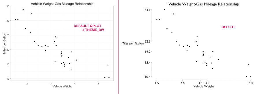
The goal is to make the axes tell a better story about the data. This is done by turning the axes into quartile plots (cleaner boxplots).
Usage Example:
Only x and y are required, everything else is optional.
qsplot(
  x = mtcars$wt, y = mtcars$mpg,
  main = "Vehicle Weight-Gas Mileage Relationship",
  xlab = "Vehicle Weight", ylab = "Miles per Gallon",
  font.family = "Gill Sans" # alternatively: "Times New Roman"
)
The R code can be found on GitHub.