Making Of: Session Tick visualization
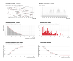
In this post I will walk through my R code for creating the top panel of the following visualization for the documentation of the session length dataset that we’ve been putting together at work:

Mikhail Popov, CC BY 4.0, via Wikimedia Commons
That instrumentation and the dataset are really cool (and privacy-preserving!) and we hope to have a blog post describing the implementation and application soon. I did want to share the code for it because I asked about it on Twitter and enough folks were interested!
There is an overview section, but at least cover the key details for this post. We were interested in measuring sessions but in a privacy-preserving way without any identifiers. The session tick instrument (written in JavaScript) sends heartbeat events (“ticks”) at a regular interval. The counter is shared across browser tabs and across the 1000+ wikis we maintain (including the 300+ language editions of Wikipedia).
The algorithm counts sessions and calculates length percentiles based on all the ticks received on any given day. Due to the daily granularity of the dataset, my visualization illustrated the process with simulated sessions in a 24-hour window.
If you want to follow along you’ll need to install {tidyverse} and {hrbrthemes} packages.
library(tidyverse)
library(hrbrthemes)

theme_set(theme_ipsum_rc(
  base_size = 14, subtitle_size = 16, axis_title_size = 12
))
Session start times are drawn from a Uniform(-2, 23) distribution because I wanted to illustrate what happens with sessions that start before the 24 hour window and end during it. Session lengths are drawn from the following gamma distribution:
ggplot() +
  geom_function(fun = ~ dgamma(.x, 1.5, 1), xlim = c(0, 5)) +
  labs(y = "Density", title = "Gamma(1.5, 1)")
The final visualization had 100 simulated sessions but here we’ll just have 20:
set.seed(1234)
n_sessions <- 19
start_times <- round(runif(n_sessions, -2, 23), 1)
session_lengths <- round(rgamma(n_sessions, 1.5, 1), 1)

# Add outlier session for illustration:
start_times <- c(-1.5, start_times)
session_lengths <- c(27.5, session_lengths)
Now that we have pairs of start times and lengths, we’ll use
map2_dfr() from
{purrr} to create a data frame of ticks for each time-length pair (the map2 part) and then bind them row-wise into one data frame (the _dfr part):
session_ticks <- map2_dfr(
  start_times,
  session_lengths,
  function(start_time, session_length) {

    times <- seq(start_time, start_time + session_length, 0.1)
    ticks <- 1:length(times)

    is_last <- ticks == length(times)
    is_inside <- times >= 0 & times < 24

    tibble(
      tick = ticks,
      time = times,
      last = is_last,
      inside = is_inside
    )

  },
  .id = "session"
)
Here’s how the end of a session looks like in this simulated dataset:
tail(session_ticks)
## # A tibble: 6 × 5
##   session  tick  time last  inside
##   <chr>   <int> <dbl> <lgl> <lgl>
## 1 19         30   7.6 FALSE TRUE
## 2 19         31   7.7 FALSE TRUE
## 3 19         32   7.8 FALSE TRUE
## 4 19         33   7.9 TRUE  TRUE
## 5 20          1   2.7 FALSE TRUE
## 6 20          2   2.8 TRUE  TRUE
Let’s start building the visualization with {ggplot2} and mapping some aesthetics to whether each tick was inside the window and whether it was the last tick of the session:
gg <- ggplot(session_ticks) +
  geom_vline(xintercept = c(0, 24), linetype = "dashed") +
  geom_point(
    aes(
      x = time, y = session,
      color = last, alpha = inside, size = last
    ),
    shape = "|"
  )
Let’s take a look at what we’re working with:
That could use some customization!
gg <- gg +
  # Make last ticks red:
  scale_color_manual(
    values = c(`TRUE` = "#dd3333", `FALSE` = "black"),
    guide = "none"
  ) +
  # Reduce opacity of ticks outside the window:
  scale_alpha_manual(
    values = c(`TRUE` = 1.0, `FALSE` = 0.3),
    guide = "none"
  ) +
  # Make last ticks bigger:
  scale_size_manual(
    values = c(`TRUE` = 3.0, `FALSE` = 1.5),
    guide = "none"
  ) +
  # Clear the y axis of session IDs:
  scale_y_discrete(name = NULL, breaks = NULL) +
  # Fake time axis:
  scale_x_continuous(
    name = "Time of day",
    breaks = seq(0, 24, 6),
    labels = function(x) {
      suffix <- ifelse(
        (x %% 24) >= 0 & (x %% 24) < 12,
        "AM", "PM"
      )
      y <- x %% 12
      paste(ifelse(y == 0, 12, y), suffix)
    }
  )
Finally let’s give it proper labels:
gg <- gg +
  labs(
    title = "Simulated session ticks, as sessions",
    caption = "Last tick value of each session is highlighted in red"
  )
The final result:
P.S.: The visualization used in the documentation was created with the help of the {patchwork} package.