Dataviz

Animation of optimization in torch

In this post I will show you how to use the {gganimate} R package to make an animated GIF illustrating Adam optimization of a function using {torch}:
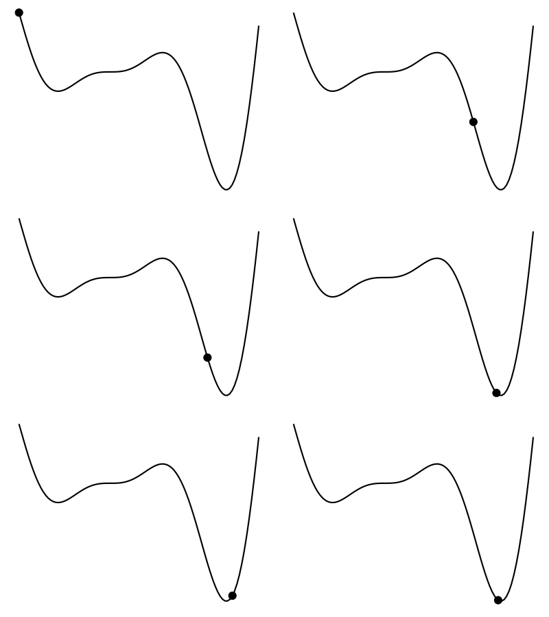
Animated GIF illustrating Adam optimization of a function

library(torch)
library(gganimate)
library(tidyverse)

We will use torch::optim_adam() to find the value of x that minimizes the following function:

f <- function(x) (6 * x - 2) ^ 2 * sin(12 * x - 4)

The function looks as follows:

The adam_iters dataset will contain an iter column (for the iteration/step identifier) and an x column (the value of x after each iteration):

Resources for learning to visualize data with R/ggplot2

I’m currently learning visualisation with R/ggplot2 and was wondering whether you could share tips/links/videos/books/resources that helped you in your journey :-)

Sure! Here ya go:

Tips

The only tip I’ll give is that you should strive to make every chart look exactly how you want it to look and say exactly what you want it to say. You will learn in the process of doing. When it’s time to visualize the data and you have an idea for a very specific look and story, don’t give it up or compromise on your vision just because you don’t know how to do it. Trust me, there is so much documentation out there and so many posts on Stack Overflow that you will be able to figure it out. (But also it’s totally fine to get 90-95% of the way there and call it done if that last 5-10% sprint is driving you bonkers.)